Linux web fonts
A couple of quick tips for improving the way the web looks under Linux:
1. Set your web browser’s default fixed-width font (“monospace font”) to Inconsolata. It is clean and highly readable. It first might be necessary to install the font, in which case hopefully your distribution has a package for it, as mine did. (Hat tip to commenters at Greg Kroah-Hartman’s Google+ page for this recommendation.)
2. For the “Georgia” font (one of Microsoft’s “core fonts for the web”, originally released as freeware, and used by a high proportion of websites), turn down the level of “hinting” with which the font is rendered. Most fonts seem best with “full” hinting, but this one I like better with “slight” hinting. This can be accomplished by inserting the following lines into one of your fontconfig files:
<!-- Slight hinting only, for "georgia" font -->
  <match target="font">
    <test name="family"><string>georgia</string></test>
    <edit mode="assign" name="hintstyle"> <const>hintslight</const></edit>
    <edit mode="assign" name="rgba">      <const>none</const> </edit>
  </match>
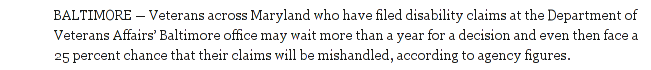
(The second ‘assign’ line turns off subpixel rendering, which in this case seems to give the font too much color fringing.) This drastically alters the appearance of the font; before the change it looks like this:
and afterwards it looks like this:
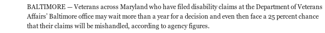
It was the appearance of the uppercase D in the former that got me looking into this. This is of course a matter of personal preference, and others will no doubt prefer the first version in general, but that D is just wrong: it shouldn’t be blurred vertically like that. And to me, the whole change seems like an upgrade. (I still might prefer the first version if I were using a display where the pixels were larger.)
For completeness, here’s the entirety of my local fontconfig file:
<?xml version="1.0"?>
<!DOCTYPE fontconfig SYSTEM "fonts.dtd">
<fontconfig>
  <match target="font">
    <edit mode="assign" name="rgba" >     <const>rgb</const> </edit>
    <edit mode="assign" name="hinting" >  <bool>true</bool>  </edit>
    <edit mode="assign" name="antialias"> <bool>true</bool> </edit>
    <edit mode="assign" name="autohint" > <bool>false</bool> </edit>
    <edit mode="assign" name="hintstyle"> <const>hintfull</const> </edit>
  </match>

<!-- Disable Autohinting for bold fonts -->
  <match target="font">
    <test name="weight" compare="more"><const>medium</const></test>
    <edit mode="assign" name="autohint">  <bool>false</bool></edit>
  </match>

<!-- Slight hinting only, for "georgia" font -->
  <match target="font">
    <test name="family"><string>georgia</string></test>
    <edit mode="assign" name="hintstyle"> <const>hintslight</const></edit>
    <edit mode="assign" name="rgba">      <const>none</const> </edit>
  </match>
</fontconfig>
I’m not an expert as to where, in general, this file should be placed, but “.fonts.conf” in your home directory is a good place to try. See the above-linked Wikipedia page for more possible locations.